Project
FlashLine Redesign
Client
Kent State University | General Audience
What is FlashLine?
The FlashLine portal serves as the primary gateway to important resource links, authenticated applications, and utilities for Kent State’s students, faculty, staff, and alumni. People rely on the portal to access to task-based items such as homework, grades, course registration, payments, and time-sensitive workflows.
Briefing
In 2015, the Systems Development team embarked on a year long redesign of the FlashLine portal, including both the back-end and front-end architecture. There were many goals of the initial redesign but among the top priorities was an overall brand new experience that would provide better task-efficiency, lower the learning curve, and make use of a fresh, modern interface to conveniently display valuable user-data. Phase-I of the redesign would move the platform from a third-party provider to an in-house managed solution, built within Drupal CMS.
My Roles
User Research:
Survey
User Interview
Information Architecture:
Card Sorts
Click-Testing
Content Strategy:
Analysis
Guidelines
Governance
UI Design:
Wireframing
Prototyping
User Testing:
Usability Testing
Process
User Research
The initial redesign was a year-long project. My approach began with user interviews, focused on students, employees, faculty, and advisors, to determine how each segment utilized FlashLine. The interview data were analyzed to reveal usage patterns per segment which lead to the understanding of ‘why’ people come to FlashLine.
Following the the analysis of the interview data, satisfaction surveys were sent to the entire university audience to gauge satisfaction and learn about the pain points of the current interface. The survey also served as a baseline for future changes and generated ideas for new elements. The survey results led to the understanding that findability was among the biggest hurdles the redesign had to address. The need for improved accessibility, search functionality, and a modern interface were also revealed in the survey. View the benchmark satisfaction survey here.
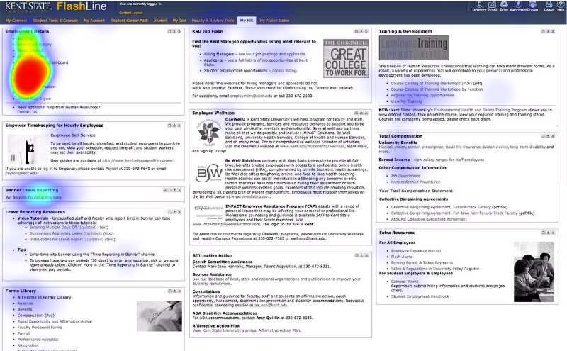
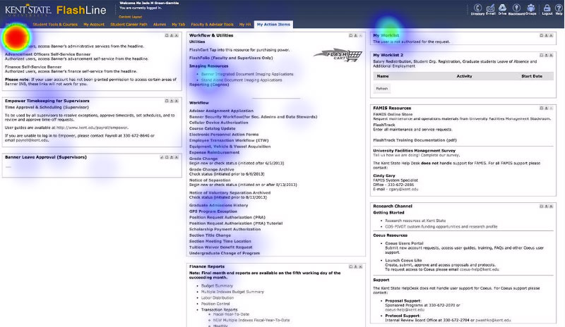
Additional surveys were designed to generate heat maps of task-based content usage, on pages where analytics were not being tracked. The goal was to learn most frequently utilized items so we could prioritize those items in the new UI.

Information Architecture
Lack of organizational was a prevalent issue for FlashLine, prior to redesign. Duplicate labels, duplicate content with different labels, and the overall lack of a category structure proved to make finding information in the portal very difficult. The initial benchmark survey revealed 30% of respondents reported ‘findability’ as the most frustrating thing about FlashLine. In response to the clear need for information architecture, a series of card sorts were conducted to inform a new navigation structure.
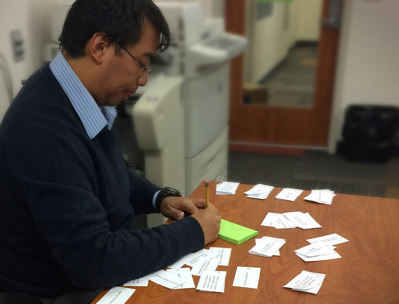
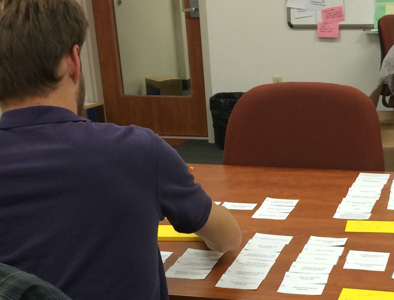
First, a small, open card sort was conducted with seven students. This information began to shape our understanding of how the students were organizing the content in their head, which appeared to be heavily task-based. A subsequent online closed card sort was then conducted. The results from these exercises, though not entirely conclusive, began to shape the category structure for the student-facing portal content. Finally, tree testing was conducted with 20 participants, which provided validation and additional direction for the category structure. View tree testing analysis here.
Content Strategy
With limited analytics data and nearly a thousand of link, managing the content in FlashLine was unwieldy. Most of the content was comprised of outbound links to pages in the Kent State website, various modules within the Banner ERP system, or other third-party task-based websites. Content was somewhat role-based, meaning there was a page for Students, HR, Faculty, Alumni, as well as pages for other facets of the community. Whether or not one was in the role, the content was made available to them. Mixed in to the “link-farm,” as it was often referred to, were small bits of often outdated events information, student life content, and poorly maintained resources, which compounded the already problematic issue of findability.
Our team of business analysts assisted in a full content inventory and analysis, pulling Google Analytics when available, and getting creative when not available. Together, we worked hand-in-hand with the various stakeholder areas including admissions, bursar, advancement, registrar, HR, academic affairs, student affairs and advising to remove stale and unused content, prioritize needed content, and strategize a path forward for future content. Part of the strategy includes an annual review of analytics data to identify gaps and remove outdated content links, as well as weekly search term analysis. We’ve established a content calendar that allows us to promote important links just-in-time, as well as rules governing the addition of new content links into the portal:
Content links are:
- access points into peripheral, Kent State authenticated systems
Content links can also be:
- content supporting peripheral, authenticated system access points
- resources that increase efficiency in university and student-serving critical tasks
- resources that are critical for student success
- federal or state-mandated requirements
- resources that contain official policies
Wireframing & UI Design
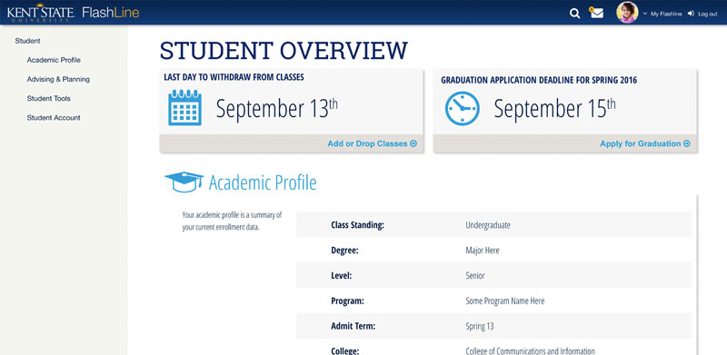
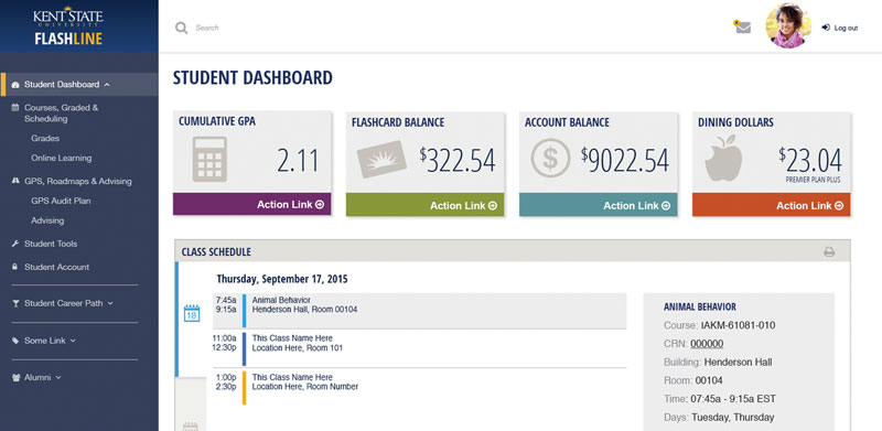
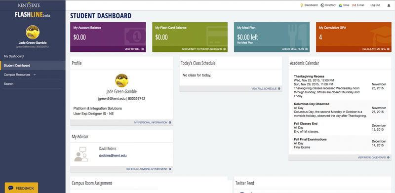
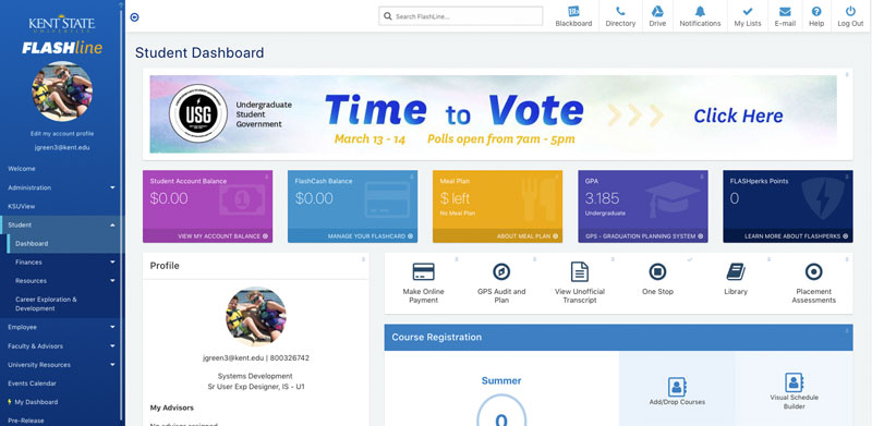
Work on designing the interface occurred simultaneously with the user research and content analysis. It was often a moving target. The earliest interface iterations focused on role-based dashboards. These dashboards displayed critical data points and priority tasks for to promote efficiency. Discount usability testing was performed with participants from each respective audience (students, staff, faculty, and advisors) per dashboard as they took shape through the many iterations.
Some iterations of the Student Dashboard:
Version 2.0
The initial launch to the general audience of the new FlashLine portal in Fall of 2016 was met with mixed reviews. Some users experienced on the old portal were aggravated by the change as learning the new paths to their task-based resources proved frustrating. They had learned, over the years exactly where a task-based resource was located in the previous system, whether or not the location was intuitive. Younger generations of students, who had less experience on the previous system, loved the new look and organization of FlashLine. They responded well to the modern interface and voiced appreciation for the new responsive design, as they could finally use it on their phones.
With the initial launch, we began collecting feedback through a mechanism on the site. Users could let us know what was working, if they encountered issues, or just had ideas that would make the portal better. This allowed us to learn of usability issues that had not arose during testing, and in 2017, we embarked on a 2.0 version. The next iteration was a year long process, lead by our development team and UI designer, that improved accessibility, navigation interaction, and standardized the interface patterns and elements across the site.
FlashLine continues to evolve today.


